Yellow living room decor has emerged as a bold, inviting choice for homeowners looking to brighten their spaces with warmth and personality. Unlike trendy colors that fade quickly, yellow works across multiple design styles, from contemporary minimalism to traditional farmhouse, and actually improves mood and social interaction in shared spaces. The challenge isn’t whether to use yellow, but how to select and balance it so the room feels sophisticated rather than overwhelming. This guide walks through choosing the right shade, applying it strategically, and layering in complementary elements to create a living room that feels both energizing and genuinely livable.
Key Takeaways
- Yellow living room decor promotes conversation and mental stimulation while brightening spaces without the heaviness of traditional warm colors, making it ideal for comfort-focused home design in 2026.
- Choose soft, pale yellows for smaller spaces or limited light, and reserve bold, saturated yellows for rooms with high ceilings and ample natural light, balancing them with at least 40% neutral surfaces to prevent visual fatigue.
- Layer yellow walls with neutral furniture bases (white, gray, beige, or natural wood) and add depth through complementary accent colors like navy, teal, and charcoal to create visual interest without overwhelming the space.
- Use accent walls, textured wallpaper, and strategic furniture placement rather than painting entire rooms or matching multiple pieces to your yellow, allowing flexibility to evolve your design over time.
Why Yellow Works for Living Rooms
Yellow is one of the few colors with genuine psychological backing for interior spaces. Research shows that yellow stimulates mental activity and promotes conversation, exactly what a living room should encourage. Unlike warmer reds or energizing oranges, yellow reads as approachable and welcoming without feeling aggressive or chaotic.
Yellow also bounces light around a room, making smaller spaces feel larger and dimmer rooms feel brighter. In 2026, as homeowners lean toward comfort-focused interiors, yellow delivers both visual and emotional warmth without the heaviness of browns or burgundies.
Another practical advantage: yellow pairs effortlessly with nearly every accent color. Soft grays become sophisticated, navy becomes nautical-modern, white stays crisp, and wood tones deepen naturally. This flexibility means homeowners aren’t locked into a specific design direction, they can evolve the room over time without repainting.
Choosing the Right Shade of Yellow
Not all yellows are equal. The wrong shade can make a living room feel childish, sickly, or overly retro. The right one becomes the foundation for the entire design. Paint samples on your wall and observe them at different times of day, morning light reveals a shade’s true undertones, while evening light can shift perception dramatically.
Bright and Bold Yellows
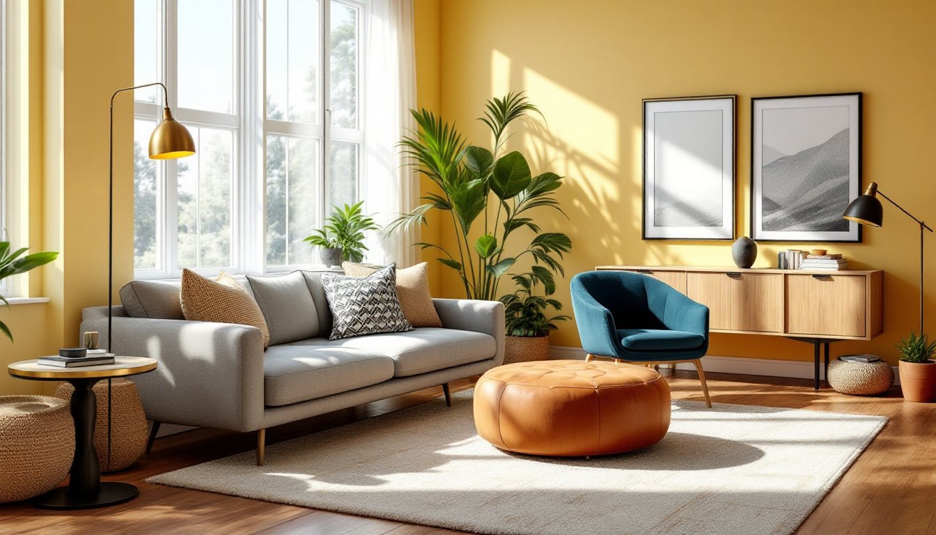
Bright, saturated yellows (think bold mustard or goldenrod) work best in rooms with plenty of natural light and high ceilings. They’re statement-making and pair beautifully with deep navy, charcoal, or forest green accents. Bold yellows suit modern, eclectic, or maximalist interiors. Keep in mind they’re visually heavy, a full room in bright yellow can feel exhausting, so use them as an accent wall or reserve them for smaller rooms with good ventilation and balanced furnishings.
Application tip: If committing to a full room in bright yellow, balance it with at least 40% neutral surfaces (white trim, light flooring, neutral furniture). This prevents visual fatigue and keeps the space feeling intentional rather than overwhelming.
Soft Pastels and Pale Yellows
Pale and buttery yellows, creams, buttermilks, and soft sunflower tones, feel more sophisticated and work in almost any lighting condition. They’re safer choices for smaller spaces or rooms with limited natural light. Soft yellows create a nurturing backdrop without demanding attention, making them ideal for traditional, farmhouse, or transitional designs.
Key advantage: Pale yellows recede slightly, letting furnishings and artwork take center stage. They’re also more forgiving if you’re unsure about committing fully. Many DIYers find that soft yellow reads almost neutral at first glance, then reveals its warmth once they’ve spent time in the space.
Key Elements: Walls, Furniture, and Accents
Choosing a yellow shade is just the starting point. The real work happens in layering textures, furniture, and accents that make the color sing without overdoing it.
Paint and Wall Treatments
Before painting, prep your walls properly. Fill holes, sand glossy finishes, and apply primer, especially if you’re covering a darker color or moving to yellow from a rich tone. Cheap primer leads to poor coverage and extra coats. Use a quality interior latex paint (eggshell or satin finish) in your chosen yellow: flat finishes hide imperfections but don’t clean well in living rooms where walls get occasional scuffs.
Coverage: One gallon typically covers 400 square feet, so measure your room and plan for two coats. Most manufacturers recommend waiting 4 hours between coats and 24 hours before moving furniture back.
Consider accent walls strategically. A single wall in bold yellow draws the eye toward a focal point, a fireplace, built-in shelving, or statement furniture piece. Or, try a feature wall in textured wallpaper in your chosen shade: this adds depth and visual interest without the commitment of painting.
Furniture Selection and Balance
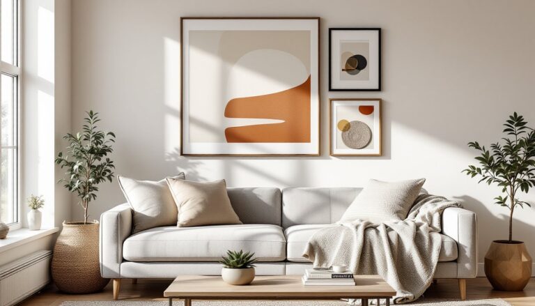
Yellow walls need grounded, intentional furniture choices. Stick to a neutral base, white, gray, beige, or natural wood, for your sofa and primary seating. This prevents the room from becoming a yellow-on-yellow jumble that reads muddy or juvenile.
Add depth with accent furniture in complementary colors: deep teal, charcoal, or even black create striking contrast against pale yellows. Navy and yellow is a classic pairing that feels both energetic and balanced. Leather in cognac, brown, or black grounds the space and adds textural variety.
Layering is key. Include at least two different materials and textures, a linen sofa with a jute rug, wooden side tables, and metal lighting fixtures. This prevents the space from feeling flat. Area rugs in neutral tones (gray, cream, or beige) define the seating zone and keep yellow walls from feeling claustrophobic.
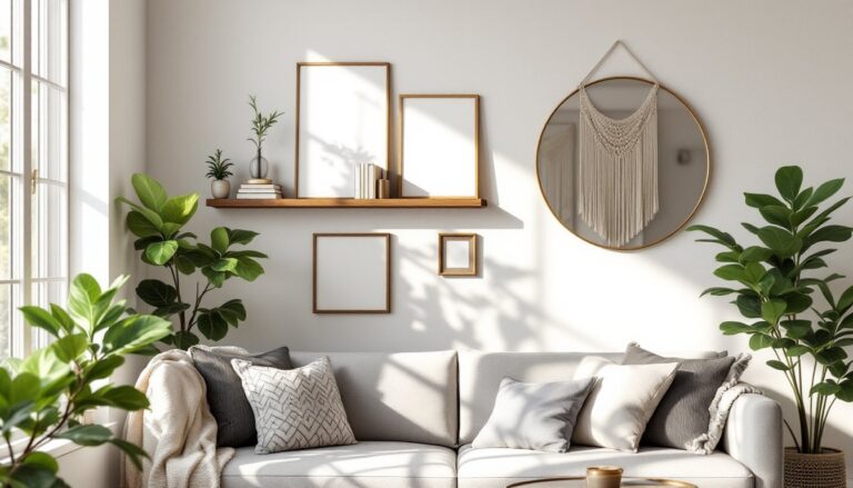
Avoid: Matching multiple furniture pieces to your yellow walls. It looks themed rather than designed. Instead, use yellow sparingly in upholstered accent chairs, throw pillows, or ottomans, these can be swapped out as trends or moods shift. Artwork and wall décor in frames of contrasting metals (brass, black, or natural wood) also break up yellow wall space without requiring permanent commitment.